There is a general feeling nowadays that economic growth has nothing to offer the average American. Yes, the gross domestic product (GDP) has been growing, but no one feels much better off. There are a lot of ways to characterize this disconnect. I've chosen to look at one simple ratio, your share of the GDP. The simplest form of this ratio is the ratio of the GDP to the population, but it is more enlightening to consider the ratio of that GDP share to the average worker's wages. Does working hard and playing by the rules get you more of the GDP or less of the GDP than it used to.
The Data Sources
First, we needed a source for the gross domestic product. A bit of searching brought us to a rather useful data source, a web site called , and particularly to their GDP database access page. This provided not only the GDP from 1790 to the year 2000, but the population as well. We augmented this data with a few numbers from the Census Bureau and the Bureau of Economic Analysis to take our numbers through 2007.
It was harder to find a good source for earnings data. The Census Bureau does provide such data, but is surprisingly coy about it. Consider the page below from the 1910 statistical abstract. It provides wages and hours, but only as percentages of relative to the baseline average of wages and hours from 1890-1899. Curiously, they do not provide the actual baseline numbers.

Later census statistical abstracts aren't quite so co. May include a useful table of average annual earnings of full time employees. These usually have an overall average and the state by state averages. Unfortunately, this table is not always present. Luckily, in honor of the bicentennial in 1976, the Census produced a wonderful set of historical statistics. This is actually available as a download, though we originally owned a print copy. This was two oversized volumes which provided us with many happy hours of browsing. Did you know that eggs cost nearly a dollar a dozen in the late 1800s? That put the 1970s inflation into perspective.
One chart we found was series D 722, 723 and 724, Average Annual Earnings of Employees: 1900-1970. Given the various means used in obfuscating earnings data, it was quite surprising to find such a useful chart. As you can see below, this chart does have its defects. Series D 722 runs from 1929 to 1970 while D 723 runs from 1900 to 1960. No one series covers the entire time period.
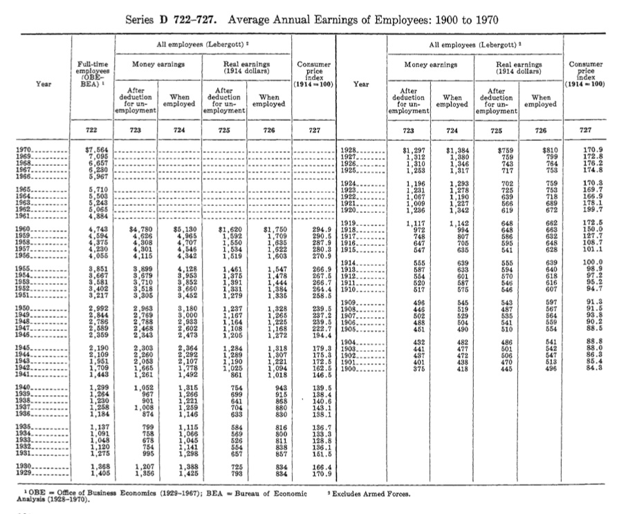
This called for some splicing. We mainly used the D 722 series, but computed a correction factor based on the overlap from 1929 to 1960. This let us adjust the D 723 series to cover the period from 1900-1928. This is methodologically suspect, if not actually bogus, but it gets us a smooth series that generally reflects the actual ups and downs as experienced by people in the workforce. This is the golden age of mashups.
Getting from 1970 into the current century was fairly easy once we noticed a URL in a more recent version of this table in one of the Census Statistical Abstracts. This led us to the Bureau of Economic Analysis which has replaced the Office of Business Economics noted on the table above. They had all the data we needed in four separate series 6.6A through 6.6.D. According to the notes in the 1976 census blockbuster, the historical D 722 series was developed by Lebergott and reflects the earnings of a full time employee as reported by a statistically weighted cross section of employers. The related series D 723 and D 724 reflect lower wages due to unemployment, so our analysis is based on the optimistic assumption that full time work is available.
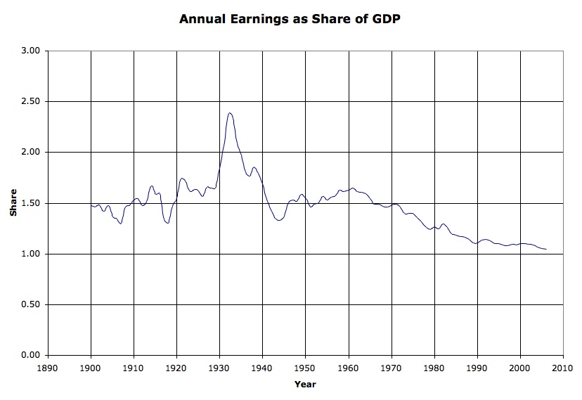
Annual Earnings as a Share of the GDP
The chart below plots [earnings / (gdp / population)]. It shows how much of the economic pie you are likely to get by working full time.
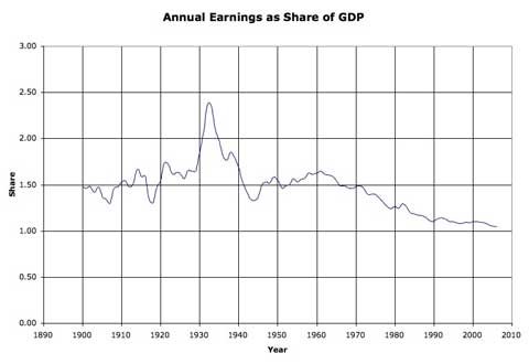
The chart has its ups and downs, but they are not all in the places that one might expect.
From 1900 to 1970, a worker's share of the GDP varied around 1.5. If everyone got exactly a fair share, as in some theoretically egalitarian state, this ratio would be about 1. This reflects the fact that not everyone worked for a living, at least not in the cash economy. Young children, pensioners, the disabled, and most married women were not in the workforce.
The ratio was higher during the Roaring 20s. That was a period of rapid industrialization, rising living standards, urbanization and increasing productivity. Historians still argue whether this was a result of the the new income tax or the outlawing of alcohol.
The ratio skyrocketed during the Great Depression. If the Roaring 20s increased the value of work, the Great Depression validated it. If you managed to have a job, you were getting a lot more of the GDP pie than during better times. Of course, the GDP was smaller. "Nice work if you can get it", as they used to say.
The Great War (World War I) and World War II lowered the ratio. War time is usually considered boom time with massive government spending and jobs for everyone. Unfortunately, war time spending is not all that efficient. While the GDP increases, a lot of that product is in the form of military victory which is hard to carry on a balance sheet.
After World War II, the ratio rose into the 1960s. This wasn't exactly the golden era, but the GI Bill had created a new generation of educated workers, American industry ruled the world, and unions were powerful in and out of the workplace. Many saw the 1960s as an echo of the 1920s. There were cultural and economic parallels between the Roaring 20s and the Go Go years, but the resemblance was superficial.
In the mid-1960s the ratio began to fall, and it has fallen since. The Vietnam War may have been one cause, but there was no post-war recovery in the mid-1970s. It is interesting to speculate about the fine details of the curve in its descent, but they are all fine details. The oscillations of earlier years are gone. The recession of the early 1980s barely registers on this chart. Neither does the recession of the early 1990s. The Roaring 90s were marked by a mere slowing of the decline, and the Bush years as a slight increase in the slope.
The ratio has dropped from around 1.5 to a bit over 1.0, a drop of about a third. It doesn't quite take two people working full time to live as well as one did during the 1950s and 1960s, it takes about one and a half. Our living standard may have improved, but the value of a day's work as a share of all goods and services has fallen.
The share of GDP has been less volatile since World War II. Perhaps the most intriguing result is the relative stability of the ratio since the 1950s. There are ripples and wiggles, but even the troughs of recession and spikes of recovery have been muted against the overall trend. Since we are looking at the earnings of full time work, this may because more workers are part time. It also may reflect increased government intervention in the economy serving to dampen the swings.
A CLOSER LOOK
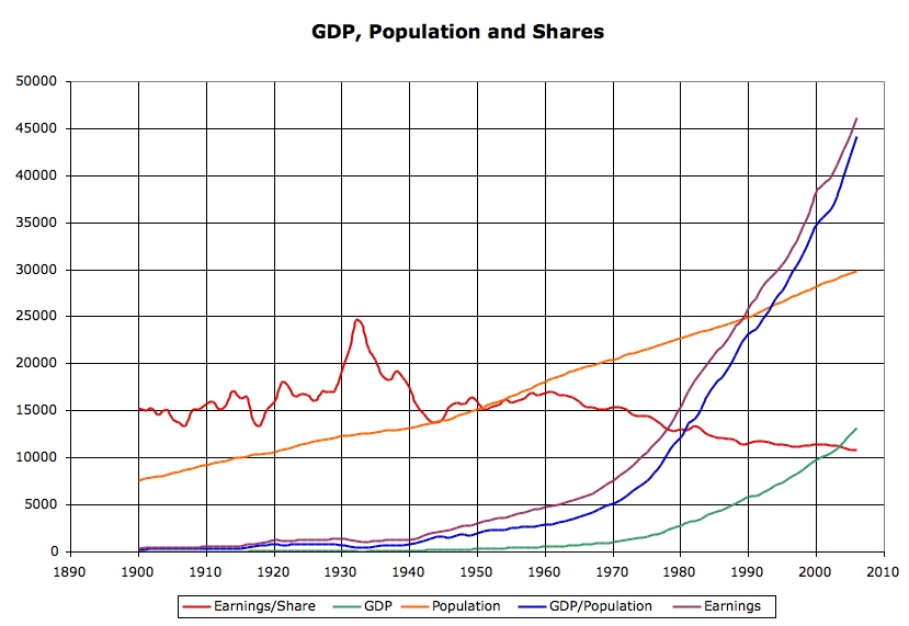
It is worthwhile taking a closer look at the data. Were there dramatic changes in population or GDP? Consider the chart below.
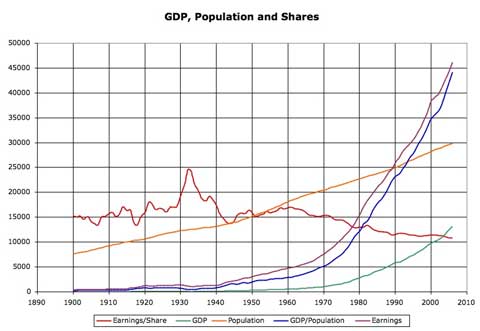
The orange line is population (in units of 10,000 people for the purposes of charting). We can see the population rise early in the century, a slow down during the Great Depression, a sharp rise during the Baby Boom, and a return to a more ordinary regime in the 70s. Population is cumulative. Most of the baby boomers are still alive, so the dramatic rise in population after World War II might play a role.
The green line is the GDP (in billions of nominal dollars), and the GDP rises dramatically throughout the era. Naively, it appears that the GDP rises exponentially, though this may be an artifact of inflation, rather than increased production. Since we consider wages in nominal dollars, we do not need to adjust earnings for inflation. The issue is not standard of living, but rather of relative value.
The blue line is GDP per person (in nominal dollars). While Malthus predicted exponential population growth and arithmetic economic growth, we are seeing arithmetic population growth and exponential economic growth, so the exponential GDP swamps the arithmetic population curve and each person's share of the GDP rises exponentially, assuming it is divided evenly.
The purple line shows annual earnings (in nominal dollars), and it appears to grow exponentially, at least partly an artifact of inflation. This number may appear suspect. In 2006, annual full time pay averaged nearly $47,000, much more than one would earn working 2,000 hours at a $14.50 median hourly wage. As noted earlier, this is an optimistic analysis, assuming that full time work is available.
The red line is annual earnings as a fraction of the individual share of the GDP (multiplied by 10,000 for the purposes of charting). It is the ratio of the purple line and the blue line, and we have traced its rise and fall. There is no obvious explanation for this ratio in this chart. The blue line (GDP per person) and the purple line (annual earnings) seem to rise in tandem. They are farther apart in good times and closer together in hard times, and it is this subtle difference that shows up in the gyrations and descent of the red line.
ONE EXPLANATION: WORKFORCE SEX
One explanation for the declining ratio of earnings to GDP share might be the increasing number of women in the workforce. Children, old people, pensioners, the wealthy and, until late in the century, women were not expected to be in the workforce. If a greater portion of the population is working, then each worker is likely to take home a smaller share of the GDP.
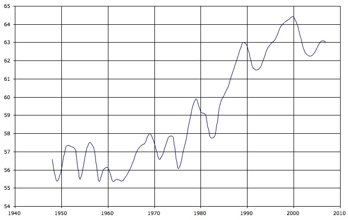
The following chart, based on Bureau of Labor statistics, shows the percentage of working age men and women in the workforce since 1948.


Men left the workforce while women joined. The percentage of men working fell by more than 10%, while the participation rate for women nearly doubled from the low 30s to nearly 60%. The chart below combines the two series to provide a closer look at overall workforce participation.
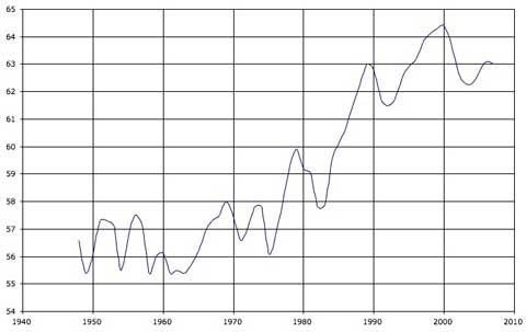
The late 1950s and early 1960s were the low point. The baby boom ended in 1964, and the chart shows women going back to work, but the big changes didn't start until the late 1970s and it continued through the 1980s. The participation rate rose from around 56% to around 63%. The ratio of the participation rates is 8 to 9, so we could account for a inverse fractional decline in GDP share per worker of about 1/9 or 11%, not the roughly 1/3 we have observed.
The participation rate has been rising since the early 1960s, when it was below 56%, but it only rose to 58% by 1970. Still, we can see an increase starting in the mid-1960s, the end of the baby boom, and continuing into the 1990s. There were recessions and set backs, but the percentage of the population in the workforce rose and continued to rise throughout this period of decline in share of GDP. Even more interesting, the rise in workforce participation seems to have leveled off in the 1990s, varying in the low to mid-60s.
ANOTHER EXPLANATION: WORKFORCE WORK
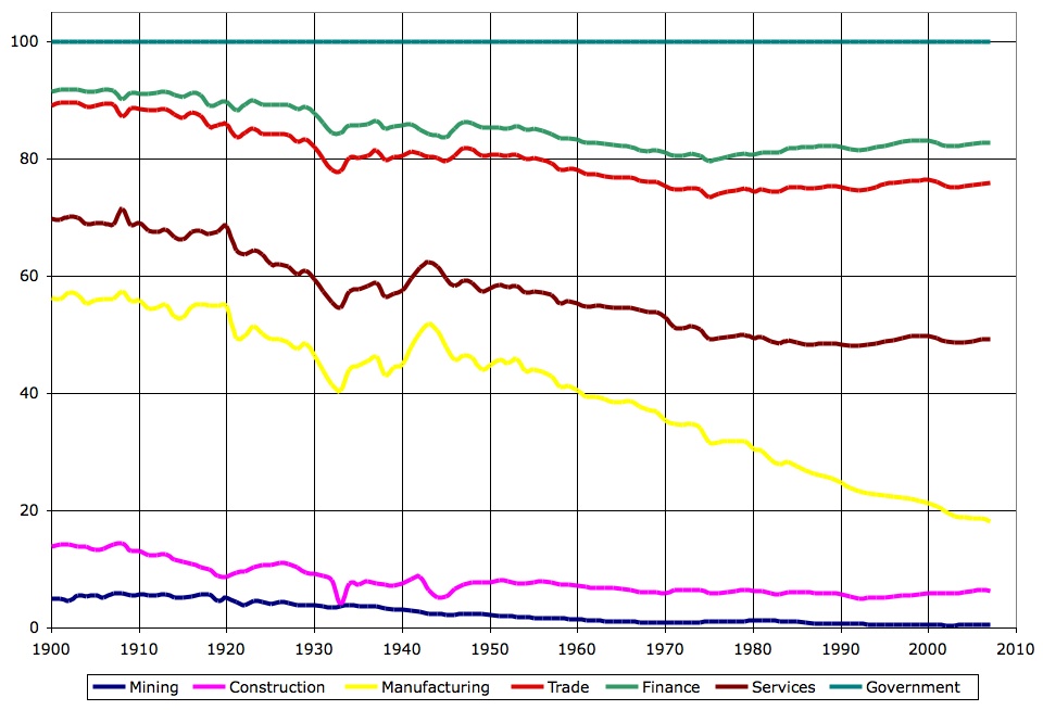
Another explanation to consider is the change in who does what. The chart below shows the percentage of workers in each major employment sector. It is based on the 1900-1970 Series D 127-141 of employment by sector, combined with the BLS 1939-2007 data from http://www.bls.gov/ces/cesbtabs.html, their Series B workforce by sector dataset, which uses a similar, but not quite identical categorization. (In other words, this was yet another series I had to build by judicious splicing).
The chart is cumulative, so that the each share is represented as the distance between two lines, and the sum of all the percentages is representated by the teal line across the top at 100%.
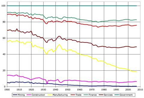
The blue line at the bottom is mining. The distance from the blue line to the purple line is share of workers in construction. This number has fallen, though the building boom of the 2000s is visible. The distance to the yellow line represents the share of workers in manufacturing and the distance from that line to the dark purple line is the share in services. The percentage of workers in manufacturing has fallen dramatically since mid-century, but the percentage of service workers has increased to take up most, but not all, of the decline. The distance to the red line represents the share of workers in trade, retail and wholesale, and the distance to the green line the share of workers in the financial sector. Neither of these sectors have changed much since mid-century. The distance above the green line represents the percentage of workers employed by the government, federal and local. This percentage peaked in the 1970s and has declined since.
We can see both structural changes, particularly between the start of the century and mid-century. The nation was nearly half rural in 1920. Still, the overall trend has involved a decline in the manufacturing sector, with a long continuous decline since the end of World War II. In terms of GDP, American productivity has not declined over this period, despite rising population, but earnings as a share of the GDP have.
Where has the rest of the GDP gone? Why doesn't a full time job give one a bigger share?
Some may have gone to Social Security and other retirement payments. People born after the Great War were not only eligible for Social Security, but they were also likely to have government insured private sector pension plans. Many have also saved money for retirement. The economic condition of retirees has been much better since the 1970s when compared with earlier eras, and people have been living longer so the nation has aged.
Some may have gone to the corporate sector, with higher corporate profits, higher dividends, increased capital gains and greatly increased pay in the executive suite. The distribution of goods and services is largely political, and the corporate sector is more politically powerful now than it was mid-century. It is now acceptible to begrudge a worker his health plan or three weeks of paid vacation, but not his boss's ten million dollar salary or hundred million dollar bonus.
Whereever the rest of the GDP growth has gone, most Americans realize that they are not going to get all that much of it by working at a full time job. Worse, full time jobs, without layoffs or reduced hours are increasingly hard to find. Part time workers get even less of their share of the GDP. Well into the 1960s, it was possible for a worker to conflate his or her own financial well being with such an abstract concept as gross domestic product. In the new century, any such worker would be considered delusional.